nuke-normal-input
2.3.12 • Public • Published NormalInput
- category: UI
- chinese: 输入框
- type: UI 组件
API
| 属性配置 |
说明 |
类型 |
默认值 |
| type |
键盘类型,可选 text url password tel date time email number |
string |
text |
| inputStyle |
input 标签的样式 |
object |
|
| clearIconStyle |
clear icon 的样式 |
object |
|
| autoFocus |
自动获得焦点 |
boolean |
false |
| multiple |
是否为多行,不选则为单行 |
bool |
false |
| value |
当前的 value 值 |
string |
|
| maxLength |
最长字数 |
number |
|
| defaultValue |
初始化的 value 值(非受控用法) |
string |
|
| disabled |
状态 设置文本域禁用状态 |
boolean |
false |
| onInput |
输入事件 |
function(e) |
false |
| onFocus |
Focus 事件 |
function |
false |
| onBlur |
Blur 事件 |
function |
false |
| onChange |
change |
function(value, e) |
|
| onReturn |
仅 native 有效,return 事件,用户在手机上点击了 return 键触发(键盘右下角),返回值 e {returnKeyType:'类型',value:'输入框的值'} |
function(e) |
false |
| returnKeyType |
仅 native 有效,return 键展示类型(键盘右下角的那个键),可选 default go next search send done |
string |
default |
| focus 实例方法 |
让 input 获得焦点 |
function |
|
| blur 实例方法 |
让 input 失去焦点 |
function |
|
| getValue 实例方法 |
获取输入框的值 |
function |
|
| rows |
多行 input 中可同时显示的行数 |
number |
2 |
| placeholder |
placeholder 文本 |
string |
无 |
| placeholderColor |
placeholder 颜色,仅 native 有效 |
string |
'#999999' |
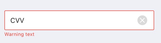
| status |
状态,可枚举"success","error",如果是 error,会有 error 样式 |
string |
success |
| errorMessage |
错误信息,配合 status error 使用 |
string |
无 |
| renderCount |
是否显示字数统计,如果开启,必须要设置 maxLength |
boolean |
false |
| hasClear |
是否渲染清除按钮 |
boolean |
false |
| onClear |
清除按钮点击事件 |
function |
|
| fixedFont |
字体大小是否随屏幕缩放 |
boolean |
false |
| hideErrorWhenFocus |
是否在 focus 状态隐藏错误。 |
boolean |
true |
关于 defaultValue 与 value (非受控与受控的差别)
- defaultValue : 传入 value 默认值,用于 constructor 中计算使用,生命周期函数改变也不会再改变。
<Input
defaultValue="羊绒大衣"
onChange={(value, e) => {
console.log(value);
}}
/>
- value: 受控用法,会随着生命周期函数改变而改变。
<Input
value={this.state.value}
onChange={(value, e) => {
console.log(value);
}}
/>
实例方法
focus = (e) => {
this.input.wrappedInstance.focus();
}
blur = (e) => {
this.input.wrappedInstance.blur();
}
change = (value,e) => {
console.log(value);
}
render(){
return (
<View>
<Input ref={(n)=>{this.input = n;}} onChange={this.change}/>
<Button type="primary" onPress={this.focus}>点我让input获得焦点</Button>
<Button type="primary" onPress={this.blur}>失去焦点,获取输入内容</Button>
</View>
)
}
-
getValue 获取当前输入框值
submitForm = (e) => {
let inputValue = this.input.wrappedInstance.getValue();
}
render(){
return (
<View>
<Input ref={(n)=>{this.input = n;}} />
<Button type="primary" onPress={this.submitForm}>提交表单</Button>
</View>
)
}
Demo
<Input
materialDesign={false}
hasClear={true}
defaultValue={'WATSON$7189833'}
onInput={this.checkLength}
status={this.state.status1}
hasWarningIcon={true}
type="text"
onChange={this.change}
placeholder="Enter Voucher Code"
errorMessage={'Voucher code error'}
/>
<Input
materialDesign={true}
hasWarningIcon={true}
defaultValue={'WATSON$7189833'}
status={'error'}
type="text"
onChange={this.change}
placeholder="Enter Voucher Code"
errorMessage={'Voucher code error'}
/>
其他

Package Sidebar
Install
Weekly Downloads