online-only-buttons
Only when the client is online clickable React buttons. Usable for forms and highly customizable.
Simple Usage
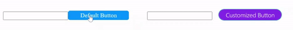
import { OnlineButton } from "online-only-buttons";

export default function App() {
    return (
            <form>
                <input type="text" name="name" />
                <OnlineButton>Hello World</OnlineButton>
            </form>
    )
}
Advanced Usage
import { OnlineButton } from "online-only-buttons";

function CustomButton({children}){
    return(
            <OnlineButton
                bg="#8634eb"
                fg="white"
                hbg="#611d91"
                hfg="#fff"
                dbg="#523c3c"
                dfg="#c4a3a3"
                borderColor="#34ebb1"
                hBorderColor="yellow"
                borderRadius="50px"
                borderWidth="3px"
                borderStyle="double"
                transitionDuration="1s"
                transitionFunction="cubic-bezier(0,1,0,1)"
                fontWeight="lighter"
                padding=".1em 1em"
                margin="1em 0 0 1em"
                fontSize="12pt"
                fontFamily="system-ui, -apple-system, BlinkMacSystemFont, 'Segoe UI'"
                offlineAnimation={false}
                offlineMessage="No connection"
                onClick={ () => window.alert("Hello World!") }>
                {children}
            </OnlineButton>
    )
}

export default function App() {
    return (
            <form>
                <input type="text" name="name" />
                <CustomButton>Customized Button</CustomButton>
            </form>
    )
}
Properties
All properties are optional except children.
- bg : type=string, explication=background color
- fg : type=string, explication=foreground color
- hfg : type=string, explication=:hover foreground color
- hbg : type=string, explication=:hover background color
- dfg : type=string, explication=disabled foreground color
- dbg : type=string, explication=disabled background color
- padding : type=string,
- margin : type=string,
- fontSize : type=string,
- fontFamily : type=string,
- fontWeight : type=string,
- borderWidth : type=string,
- borderRadius : type=string,
- borderColor : type=string,
- hBorderColor : type=string, explication=:hover border color
- borderStyle : type=string,
- transitionDuration : type=string,
- transitionFunction : type=string,
- offlineAnimation : type=boolean,
- offlineMessage : type=string, explication=message will be displayed when offline
- onClick : type=MouseEventHandler
- children : type=string | JSX.Element | JSX.Element[], explication=Child element/s written between component tag