
Scoped Style
Scoped style is a next gen tiny css-in-js library to help you style your components. Use the full power of css that you are used to.
Works With
Installation
npm i scoped-style// oryarn add scoped-styleUsage
; // for react;const styled = ;// // for Preact;const styled = ;// // for Hyperapp;const styled = ;// // for Infernojs;const styled = ;// // define global cssstyledglobal` * { margin: 0; } html, body { width: 100%; height: 100%; }`; // and scoped cssconst Button = ` background: ; border: none; border-radius: 2px; :hover, :focus, :active { padding: 10px; } @media screen and (max-width: 640px) { background: blue; :hover, :focus, :active { padding: 5px; } }`; // keyframesconst spin = styledkeyframes` to { transform: rotate(360deg); }`; const Loader = ` border: 3px solid hsla(185, 100%, 62%, 0.2); border-top-color: #3cefff; border-radius: 50%; width: 2em; height: 2em; animation: 1s linear infinite;`; // styling childrenconst BlueChildren = ` > * { color: blue; }`; const App = <div> <Button primary>Login</Button> <Loader /> <BlueChildren>children</BlueChildren> </div>; // Your rendering codeConfiguration
generateID - application code
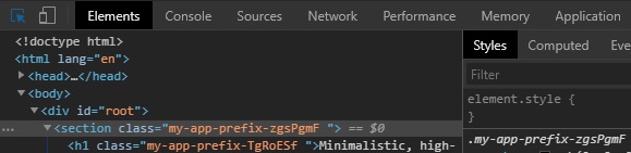
Scoped style lets you choose the way class names are generated.
This is possible via generateID method which can be replaced by your own implementation:
// <componentName>.styles.js ;; // These two lines below are responsible for achieving custom class name generationconst defaultGenerateID = scopedgenerateID;scoped `my-app-prefix-`; const styled = ; const Container = ` padding: 10px; color: #000;`; const AppDescription = ` color: #0f0f0f;`;Having added that you should end up with something like this:
Support and limitations
Combinators
Supported :
Not supported :
Selectors
Selectors must be used in with a combinator.
We support them all :
Pseudo selectors
We support them all.
Warning, if you are using the content property : special characters (like ◀) are not suppoted, you must convert them (via http://enc.joyho.net/ for example) and it will work (content: "\\25C0";).
Questions, bugs and feature requests
You have a question about usage, feel free to open an issue.
You found a bug, feel free to open an issue.
You've got a feature requests, feel free to open an issue.
Advanced example : radio button, checkbox
const Label = ` position: relative; padding-left: 2rem; padding-right: 0.75rem; margin-bottom: 0.75rem; cursor: pointer; font-size: 1rem; user-select: none; > input { position: absolute; opacity: 0; cursor: pointer; height: 0; width: 0; } > input[type='checkbox'] ~ span { position: absolute; top: 0.2rem; left: 0; height: 1rem; width: 1rem; background-color: #eee; } > input[type='radio'] ~ span { position: absolute; top: 0.2rem; left: 0; height: 1rem; width: 1rem; background-color: #eee; border-radius: 50%; } :hover > input ~ span { background-color: #ccc; transition: 0.2s; } > input:checked ~ span { background-color: #0080b3; } :active > span { transform: scale(0); } > span:after { content: ''; position: absolute; display: none; } > input:checked ~ span:after { display: block; } > input[type='checkbox'] ~ span:after { left: 0.25rem; top: 0.05rem; width: 0.25rem; height: 0.6rem; border: solid white; border-width: 0 0.2rem 0.2rem 0; transform: rotate(45deg); } > input[type='radio'] ~ span:after { left: 0.3rem; top: 0.3rem; width: 0.4rem; height: 0.4rem; border-radius: 50%; background: white; }`; const Radio = <Label> name <input type="radio" checked=checked onChange=onChange /> <span></span> </Label>; const Checkbox = <Label> name <input type="checkbox" checked=checked onChange=onChange /> <span></span> </Label>;Scoped function second parameter
;scoped can take a second parameter : a callback who "render" the css generated by styled function.
The default callback is exported via scoped.defaultCallback.
SSR example
Client :
;; if typeof global !== 'undefined' globalscopedStyleCSS == ''; const styler = { if typeof document !== 'undefined' scoped; else if typeof global !== 'undefined' globalscopedStyleCSS += css; }; const styled = ;Server :
app;