
A powerful and elegant alternative for all your tooltips and menu needs.
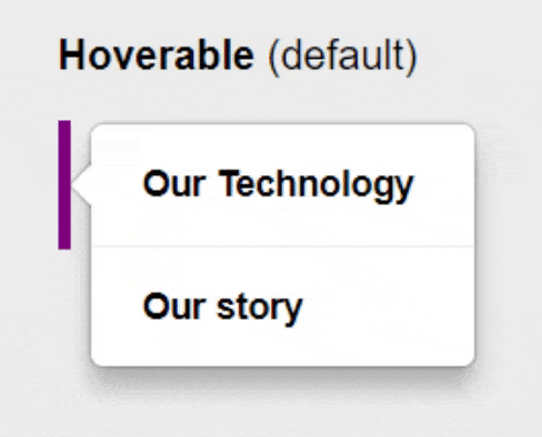
- Different Types - For every use context: Choose between Hoverable, Static & Alert tooltips.
- Fully Customizable - Easily change default settings via props
- Reliable Positioning - Align your tooltip to your target element with ease
- Tailwind CSS
- React Hooks
Ported from react-power-tooltip pages to see all use cases.
pnpm dev
pnpm install woby-tooltipImportant: Set the position of the hoverable parent component to relative.
import { $, $$, useMemo } from 'woby'
import { Tooltip } from 'woby-tooltip'

export const AlignPositions = () => {
    const hover = $<string | boolean>(false)

    // const hoverHandler = (side: boolean) => setHover(side)

    return <div class='relative text-sm w-[250px]'>
        <Tooltip
            show={useMemo(() => $$(hover) === 'left')}
            position="left top"
            arrowAlign="center"
            textboxWidth="auto"
            static
        >
            <span>Top</span>
        </Tooltip>
        <Tooltip
            show={useMemo(() => $$(hover) === 'left')}
            position="left center"
            arrowAlign="center"
            textboxWidth="auto"
            static
        >
            <span>Center</span>
        </Tooltip>
        <Tooltip
            show={useMemo(() => $$(hover) === 'left')}
            position="left bottom"
            arrowAlign="center"
            textboxWidth="auto"
            static
        >
            <span>Bottom</span>
        </Tooltip>
        <Tooltip
            show={useMemo(() => $$(hover) === 'right')}
            position="right top"
            arrowAlign="center"
            textboxWidth="auto"
            static
        >
            <span>Top</span>
        </Tooltip>
        <Tooltip
            show={useMemo(() => $$(hover) === 'right')}
            position="right center"
            arrowAlign="center"
            textboxWidth="auto"
            static
        >
            <span>Center</span>
        </Tooltip>
        <Tooltip
            show={useMemo(() => $$(hover) === 'right')}
            position="right bottom"
            arrowAlign="center"
            textboxWidth="auto"
            static
        >
            <span>Bottom</span>
        </Tooltip>
        <Tooltip
            show={useMemo(() => $$(hover) === 'top')}
            position="top left"
            arrowAlign="center"
            textboxWidth="auto"
            static
        >
            <span>Left</span>
        </Tooltip>
        <Tooltip
            show={useMemo(() => $$(hover) === 'top')}
            position="top center"
            arrowAlign="center"
            textboxWidth="auto"
            static
        >
            <span>Center</span>
        </Tooltip>
        <Tooltip
            show={useMemo(() => $$(hover) === 'top')}
            position="top right"
            arrowAlign="center"
            textboxWidth="auto"
            static
        >
            <span>Right</span>
        </Tooltip>
        <Tooltip
            show={useMemo(() => $$(hover) === 'bottom')}
            position="bottom left"
            arrowAlign="center"
            textboxWidth="auto"
            static
        >
            <span>Left</span>
        </Tooltip>
        <Tooltip
            show={useMemo(() => $$(hover) === 'bottom')}
            position="bottom center"
            arrowAlign="center"
            textboxWidth="auto"
            static
        >
            <span>Center</span>
        </Tooltip>
        <Tooltip
            show={useMemo(() => $$(hover) === 'bottom')}
            position="bottom right"
            arrowAlign="center"
            textboxWidth="auto"
            static
        >
            <span>Right</span>
        </Tooltip>
        <div class="square purpleGradient">
            <div class='absolute w-full h-full flex items-center justify-center text-[15px]'>
                <div class='w-[70%] flex flex-row justify-between'>
                    <span>Left</span>
                    <span>Right</span>
                </div>
            </div>
            <div class='absolute w-full h-full flex items-center justify-center text-[15px]'>
                <div class='h-[70%] flex flex-col justify-between items-center'>
                    <span>Top</span>
                    <span>Bottom</span>
                </div>
            </div>
            <div
                class="left"
                onMouseEnter={() => hover('left')}
                onMouseLeave={() => hover(false)}
            />
            <div
                class="top"
                onMouseEnter={() => hover('top')}
                onMouseLeave={() => hover(false)}
            />
            <div
                class="right"
                onMouseEnter={() => hover('right')}
                onMouseLeave={() => hover(false)}
            />
            <div
                class="bottom"
                onMouseEnter={() => hover('bottom')}
                onMouseLeave={() => hover(false)}
            />
        </div>
    </div>
}| Props | Types / Options | Default | Description |
|---|---|---|---|
| show | bool: false, true | false | Mount tooltip if true. |
| fontFamily | string: font family | 'inherit' | Font family of text |
| fontSize | string: px | 'inherit' | Font size of text |
| fontWeight | string | 'bold' | Font weight of text |
| color | string | 'inherit' | Font color of text |
| animation | string: fade or bounce | 'fade' | Mount/Unmount anmation. Custom animations: See advanced usage examples. |
| hoverBackground | string: hex colors | '#ececec' | Background color on hover |
| hoverColor | string: hex colors | '#000000' | Font color on hover |
| backgroundColor | string: hex colors | '#ffffff' | Background color |
| alert | string: rgb colors | false | Pulse animation |
| textboxWidth | string: px or auto | '150px' | Width of the text box |
| padding | string: px | '15px 20px' | Padding of text |
| borderRadius | string: px | '5px' | Radius of corners |
| zIndex | string: number | '100' | Z-index of tooltip |
| moveDown | string: px | '0px' | Downward position adjustment |
| moveRight | string: px | '0px' | Right position adjustment |
| static | boolean: false or true | false | Disable hover animations |
| flat | boolean: false or true | false | Disable shadows |
| lineSeparated | boolean: false or true or string: css border property | '1px solid #ececec' | Enable ∓ specify line separation between options |
| arrowAlign | string: 'start' or 'center' or 'end' | 'start' | Positions arrow relative to textbox |
| position | string: 'position1 position2' | 'right center' | Positions tooltip relative to target element |
You're welcome to contribute to woby-power-tooltip.
To set up the project:
- Fork and clone the repository
$ npm install$ npm run dev
MIT