Docsify Accordion Plugin
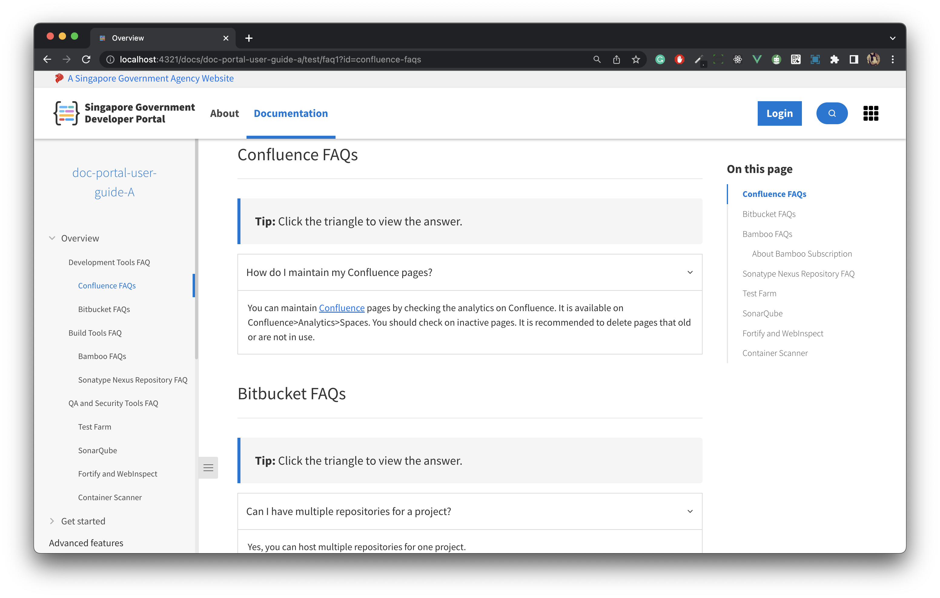
A Docsify Accordion that replaces the standard markdown accordion to an accordion that follows the
SGDS Convention for the Singapore Government Documentation Portal
Usage
·
Report Bugs
·
Request Features
Table of Contents
About the project
Hello there! We are the team behind the
Usage
-
Configure docsify-accordion-plugin:
<script>
	window.$docsify = {
		 useSGDSAccordion: true
	};
</script>
-
Insert style/script into docsify document:
<!-- head -->
<head>
	<!-- Insert your different plugins here... -->
	<link rel="stylesheet" href="https://unpkg.com/@developerportalsg/docsify-accordion-plugin@latest/dist/accordion.css" />
	<link rel="stylesheet" href="https://cdn.jsdelivr.net/npm/@govtechsg/sgds@1.4.0/css/sgds.css" />
</head>

<!-- body -->
<body>
	<!-- Insert your different plugins scripts here... -->
	<script src="https://unpkg.com/@developerportalsg/docsify-accordion-plugin@latest/dist/docsify-plugin-accordion.min.js"></script>
</body>
- Create an accordion how you would using markdown
<details>
<summary>This is a super cool title</summary><!-- Good place for a CTA (Call to Action) -->
  <!-- leave an empty line *️⃣  -->
  <p>This is a super cool paragraph</p>
  <small>This is a super cool small paragraph</small>
  <b>Veni Vidi Vici</b>
</details>
<!-- leave an empty line *️⃣  -->

<details>
<summary><h1>Very Big Title</h1></summary><!-- Customise the Weight, Typography, etc to your liking! -->
<!-- leave an empty line *️⃣  -->

<!-- Compatible with plugins such as mermaid too! -->
</details>
 <!-- leave an empty line *️⃣  -->
Options
Here are the attributes to customise the logic or styles of the accordion
| Attribute | Type | Default | Description |
|---|---|---|---|
data-is-open="*VALUE*" |
boolean |
false |
Replace *VALUE* with true or false to expand the accordion on page load. |
data-is-size="*VALUE*" |
string |
medium |
Replace *VALUE* with is-small, is-medium, or is-large for various text sizes. |
data-is-color="*VALUE*" |
string |
null |
Replace *VALUE* with contextual text color classes (is-danger, is-warning, is-success, etc.) for various background colors. For more colour choices, reference here! |
<details data-is-open="true" data-is-size="small" data-color="is-warning">
  <summary>...</summary>

   ...
</details>
<!-- leave an empty line *️⃣ -->Contributing
Contributions are what make the open source community such an amazing place to learn, inspire, and create. Any contributions you make are greatly appreciated.
If you have a suggestion that would make this better, please fork the repo and create a pull request. You can also simply open an issue with the tag "enhancement". Don't forget to give the project a star! Thanks again!
- Fork the Project
- Create your Feature Branch (
git checkout -b feature/AmazingFeature) - Commit your Changes (
git commit -m 'Add some AmazingFeature') - Push to the Branch (
git push origin feature/AmazingFeature) - Open a Pull Request
Built with
Our plugin is built using Docsify, a lightweight documentation generator, along with other technologies such as HTML, JavaScript and CSS.
License
Distributed under the MIT License. See LICENSE.txt for more information.
References
You can find our plugin on GitHub. Please refer to the README file for detailed instructions on how to use it.


