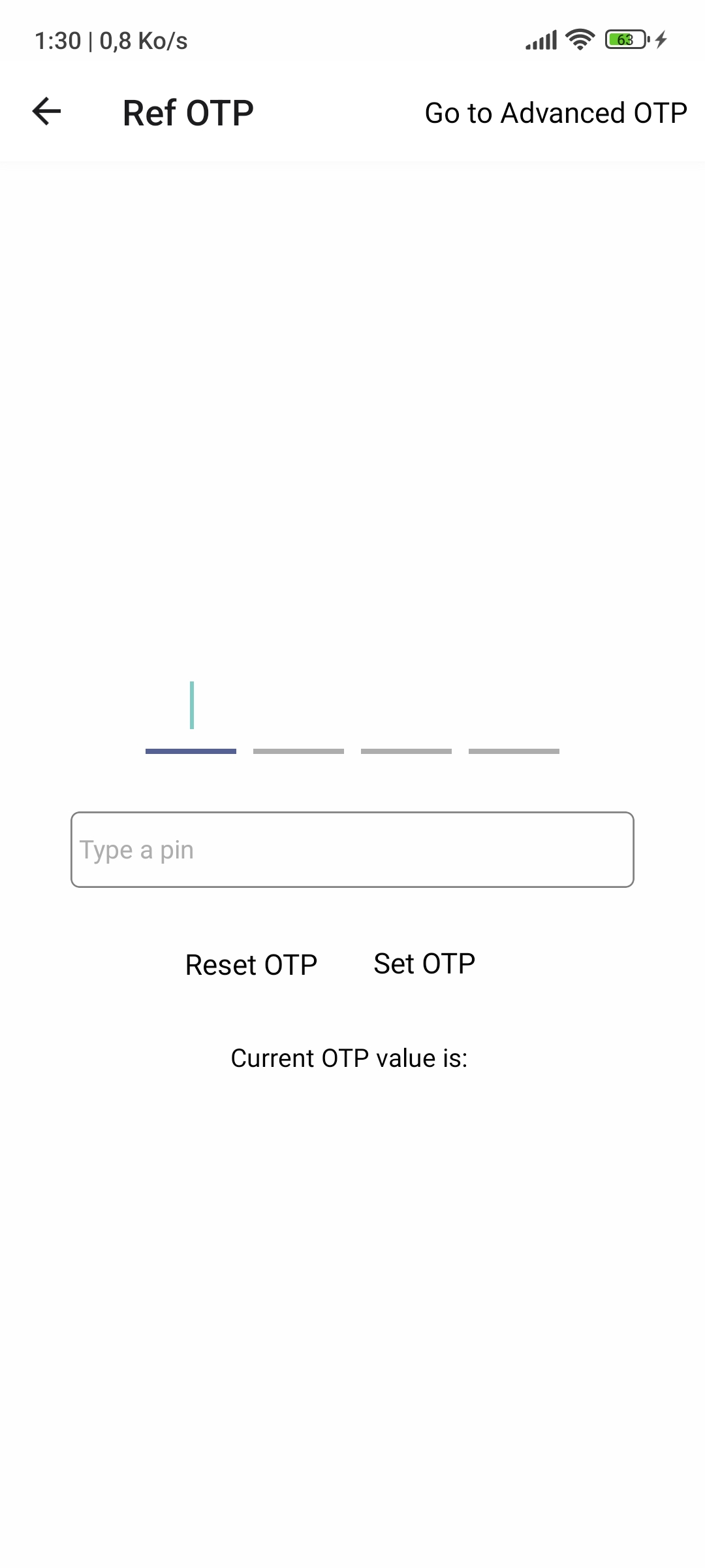
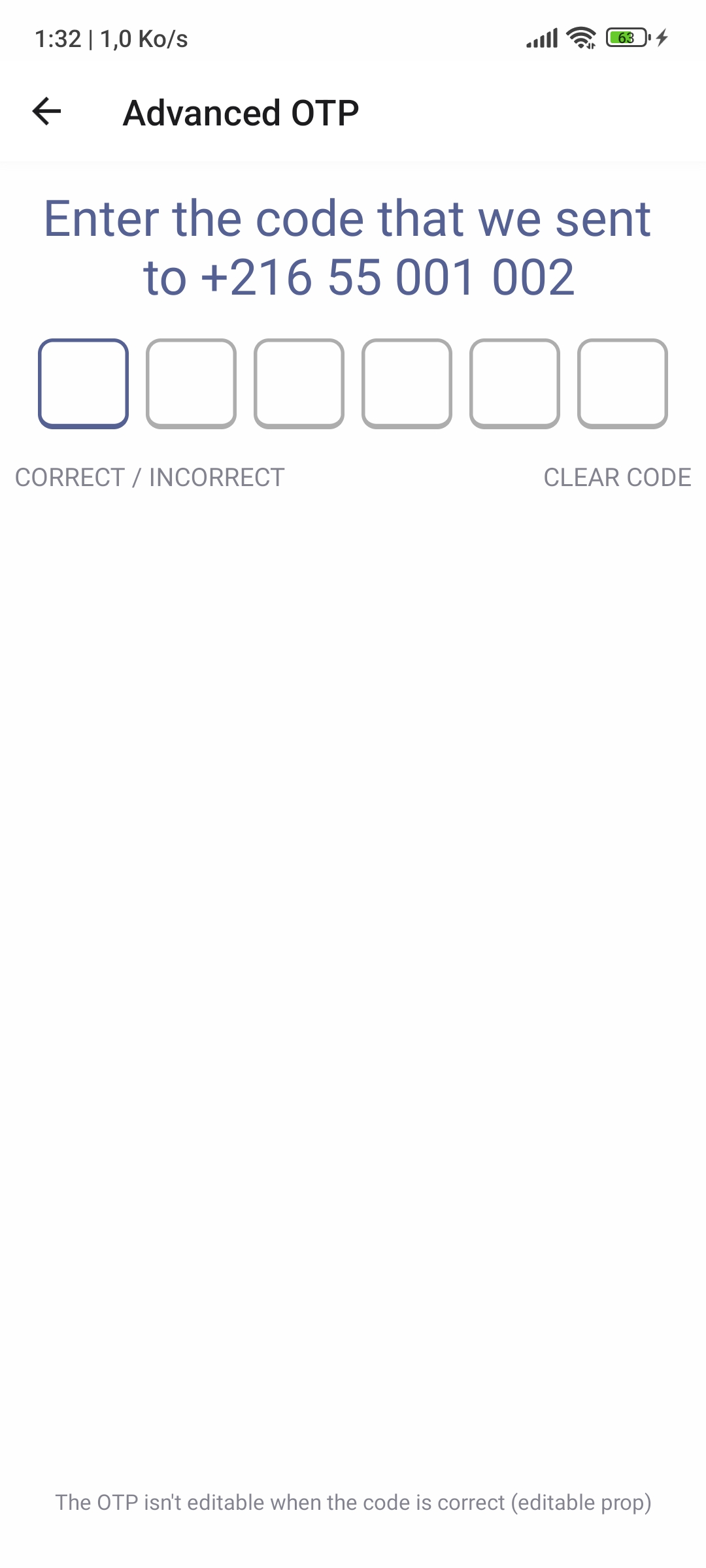
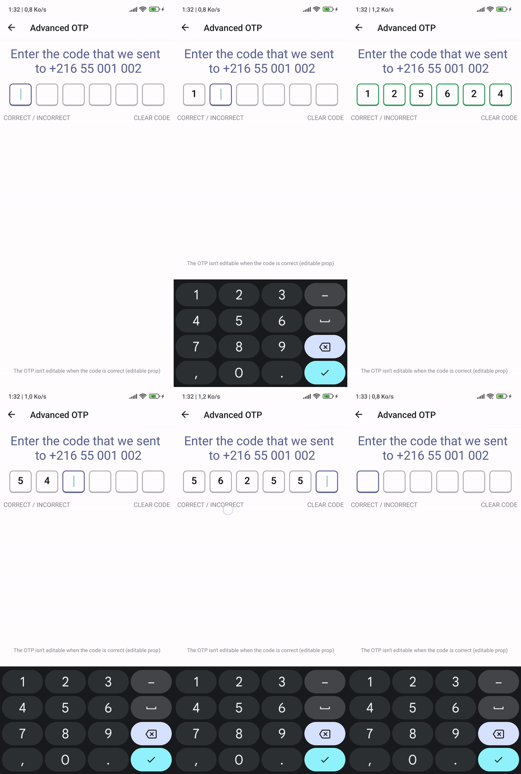
An elegant and highly customizable One-Time Password (OTP) input library designed to simplify the implementation and enhance the user experience of OTP authentication flows in React Native Applications.
- ✍ Written in TypeScript.
- 📱 Supports Android / iOS / Web.
- 🎨 Highly customizable.
- 🚀 Easy to use.
- 🍃 Lightweight.
- 📏 Fully responsive.
- 🌐 Supports RTL.
- 🌛 Supports Dark Mode.
- 💅 Supports custom styles.
- 🎹 Supports custom keyboard types.
These screenshots show the OTP Text Input in action, with different styles and configurations. taken from the example project below.
Web Demo Gif: Web Gif
NPM:
npm install @sectiontn/otp-inputYARN:
yarn add @sectiontn/otp-inputImport the OTP component from the @sectiontn/otp-input package and use it in your React Native application.
import { OTPTextInput } from '@sectiontn/otp-input';You may need to import type OTPTextViewHandle to use the ref on the component (if you use TypeScript).
import { OTPTextInput, type OTPTextInputHandle } from '@sectiontn/otp-input';
// Later in your component.
const OTPRef = useRef<OTPTextInputHandle || null>(null);Call the OTPTextInput component in your JSX code and pass the required props to customize the OTP input field.
import { Platform } from 'react-native';

// later in your component's render

<OTPTextInput
  ref={OTPRef}
  inputCount={4}
  tintColor={"#FF6F61"}
  offTintColor={"#BBBCBE"}
  onTextChangeHandler={(pin: string) => {
    console.log('Current OTP:', pin);
  }}
  editable={true}
  autoFocus={true}
  keyboardType={Platform.OS === 'ios' ? 'number-pad' : 'numeric'}
/>There's no required prop as you can see, if you pass an empty props eg, <OTPTextInput />, the component will work with the default values.
| Prop name | Type | Default Value | Description |
|---|---|---|---|
| defaultValue | string | " " | The default value for the OTP input |
| inputCount | number | 4 | The number of OTP input fields |
| tintColor | string | '#566193' | The color of the focused OTP input field |
| offTintColor | string | '#DADADA' | The color of the non-focused OTP input fields |
| inputMaxLength | number | 1 | The maximum length of each OTP input field |
| containerStyle | object | {} | The custom style for the OTP container component |
| textInputStyle | object | {} | The custom style for the OTP text inputs |
| onTextChangeHandler | function | undefined | Call back function to handle OTP text change |
| onBlur | function | undefined | Called when an input field loses focus |
| onFocus | function | undefined | Called when an input field gets focus |
| keyboardType | KeyboardTypeOptions | 'numeric' | Determines the type of keyboard to be displayed |
| editable | boolean | true | Determines whether or not the OTP input is editable |
| autoFocus | boolean | true | Determines whether or not the first input field should automatically get focus |
| useNumbersRegex | boolean | true | If true, the input will be validated against a default number-based regex |
| useCustomRegex | boolean | false | If true, a custom regex set by customRegex prop will be used for validation |
| customRegex | RegExp | '\d*' | This provides the custom regex for input validation when useCustomRegex is true. |
NB: you cannot use both useNumbersRegex and useCustomRegex at the same time.
Full Example: Check the example at OTP Input Example made with react-native-cli.
Advanced Usage: Expo Snack Demo
See the contributing guide to learn how to contribute to the repository and the development workflow.
📜 License GPLv3 license.
Copyright (C) 2024 Mohamed Rayen Sbai

This program is free software: you can redistribute it and/or modify
it under the terms of the GNU General Public License as published by
the Free Software Foundation, either version 3 of the License, or
(at your option) any later version.

This program is distributed in the hope that it will be useful,
but WITHOUT ANY WARRANTY; without even the implied warranty of
MERCHANTABILITY or FITNESS FOR A PARTICULAR PURPOSE.  See the
GNU General Public License for more details.

You should have received a copy of the GNU General Public License
along with this program.  If not, see <https://www.gnu.org/licenses/>.
Made with create-react-native-library


