ink-select 

Select Component for Ink
Demo
Install
$ npm install ink-select
Usage
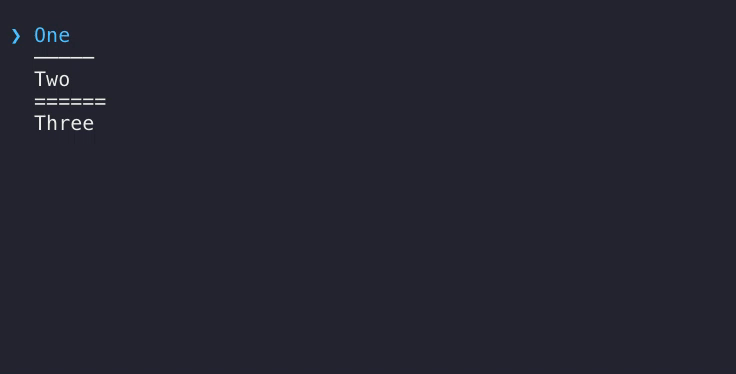
const h Component render Text = ;const Select Option Separator = ; { return <div> <Select onSelect= this> <Option value='1'>One</Option> <Separator /> <Option value='2' onSelect= this>Two</Option> <Separator label='======' /> <Option value='3'>Three</Option> </Select> <br /> thisstate && thisstatemessage && <Text green>thisstatemessage</Text> </div> ; } const unmount = ;Or, if you want to pass options as an array to get the same result:
const h Component render Text = ;const Select Option Separator = ; { const options = label: 'One' value: 1 label: 'Two' value: 2 this label: '======' label: 'Three' value: 3 ; return <div> <Select options=options onSelect= this/> <br /> thisstate && thisstatemessage && <Text green>thisstatemessage</Text> </div> ; } const unmount = ;Where any item that has no value key will be a separator. If label is passed it will be used, otherwise it will use the default.
Props
Select
cursorCharacter
Type: string
Default: ❯
This character is used for the cursor.
onChange(value)
Type: Function
Function to call when the cursor is moved up or down.
onSelect(value)
Type: Function
Function to call when an item is selected by pressing Enter/Space
Option
value
Type: any
Required
Is passed to onChange and onSelect when this item is selected
Separator
label
Type: string
Default: —————
Text to be used as the separator
Key bindings
| key | action |
|---|---|
| Space | select option |
| Enter | select option |
| ↑ | move the cursor up |
| ↓ | move the cursor down |
Related
- ink-select-input - Alternative Select input component
- ink-scrollbar - Scrollbar component
LICENSE
MIT © 2018 George Karagkiaouris