
Customizable TomTom autocomplete component for iOS and Android React-Native apps
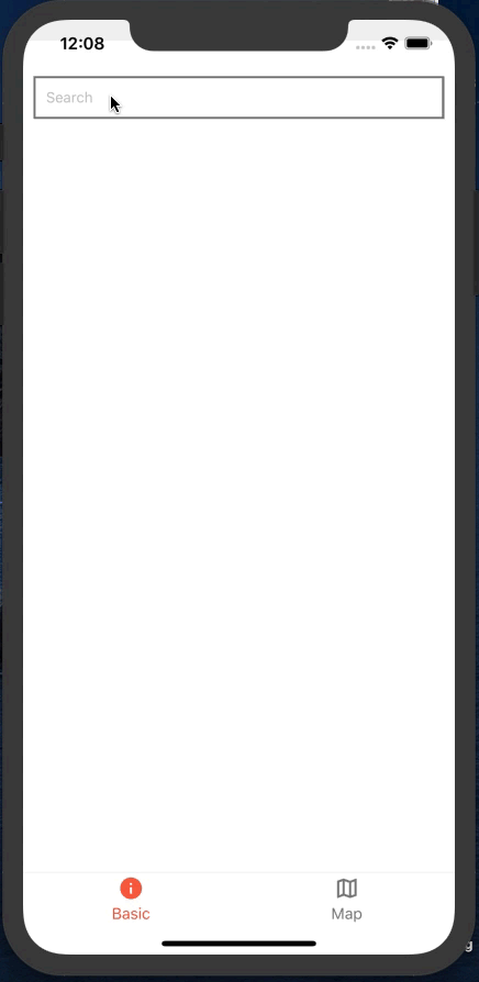 Basic Basic |
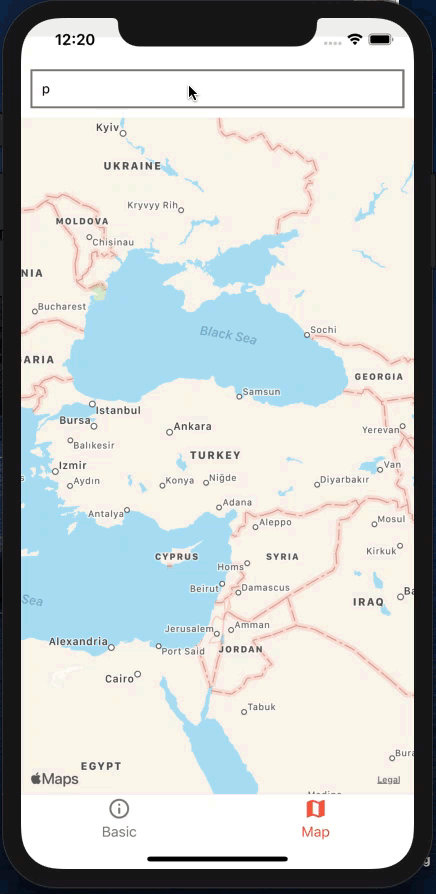 With Map With Map |
- npm
npm install react-native-tomtom-autocomplete --save
- yarn
yarn add react-native-tomtom-autocomplete
- Get your free TomTom API key.
Example
import React from 'react';
import AutoCompleteInput from "react-native-tomtom-autocomplete";

...

<AutoCompleteInput
    inputProps={{
        placeholder: "Search",
    }}
    onPress={(item) => console.log('item', item)}
    inputContainerStyle={{
        padding: 10,
        margin: 10,
        borderWidth: 2,
        borderColor: "grey",
    }}
    listItemsContainerStyle={{
        padding: 10,
        marginHorizontal: 10,
        borderWidth: 2,
        borderColor: "grey",
    }}
    bottomDivider
    tomtomOptions={{ key: "TOMTOM_API_KEY" }}
/>
...This list is a work in progress. PRs welcome!
Genereal Props
| Prop | type | description | default | required |
|---|---|---|---|---|
| tomtomOptions | TomTomOptions |
key attribute with tomtom api key is must, to see the full list of optional parameters, check TomTom API Docs | --- | true |
| inputContainerStyle | ViewStyle |
container style for text input | --- | false |
| inputProps | TextInputProps |
props for text input | --- | false |
| listItemsContainerStyle | ViewStyle |
container style for list items | --- | false |
| titleExtractor | function | function to define which item property will be displayed in the first line, takes api response item as the parameter items |
--- | false |
| subtitleExtractor | function | function to define which item property will be displayed in the second line, takes api response item as the parameter items |
--- | false |
| disabledExtractor | function | function to define for which items to apply disabled style, takes api response item as the parameter items |
--- | false |
| delay | number | debounce effect for text input. This can be used to wait for user to finish typing, that will prevent unnecessary api requests for each change in text input. If you don't want a debounce effect, then set it to 0
|
300 | false |
Additional Props
These props are for list items, all optional.
| Prop | type | description |
|---|---|---|
| titleStyle | TextStyle |
custom style for title |
| titleProps | ViewProps |
custom props for title container |
| subtitleStyle | TextStyle |
custom style for subtitle |
| subtitleProps | ViewProps |
custom props for subtitle container |
| containerStyle | ViewStyle |
custom style for outer container |
| onPress | function | (item: TomTomPOISearchResponseResult, event: GestureResponderEvent) => void |
| onLongPress | function | (item: TomTomPOISearchResponseResult, event: GestureResponderEvent) => void |
| leftElement | ReactNode |
component to render at the left side of each list item |
| rightElement | ReactNode |
component to render at the right side of each list item |
| contentContainerStyle | ViewStyle |
custom style for content container |
| disabledStyle | ViewStyle |
this should be used with disabledExtractor. custom style for disabled list item |
| bottomDivider | boolean | if bottom divider should be rendered after each list istem |
| topDivider | boolean | if bottom divider should be rendered before each list istem |
- [x] Places autocompletion
- [x] iOS and Android compatibility
- [ ] ActivityIndicatorIOS/ProgressBarAndroid loaders
- [x] Typescript types
- [ ] Tests