wym-cascader
React Cascader Component


Browser Support
 |
 |
 |
 |
 |
|---|---|---|---|---|
| IE 8+ ✔ | Chrome 31.0+ ✔ | Firefox 31.0+ ✔ | Opera 30.0+ ✔ | Safari 7.0+ ✔ |
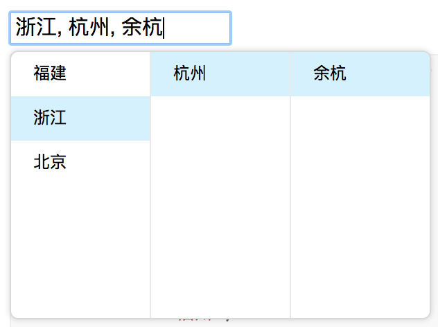
Screenshots
Example
http://react-component.github.io/cascader/
Install

$ npm install rc-cascader --saveUsage
;; const options = 'label': '福建' 'value': 'fj' 'children': 'label': '福州' 'value': 'fuzhou' 'children': 'label': '马尾' 'value': 'mawei' 'label': '泉州' 'value': 'quanzhou' 'label': '浙江' 'value': 'zj' 'children': 'label': '杭州' 'value': 'hangzhou' 'children': 'label': '余杭' 'value': 'yuhang' 'label': '北京' 'value': 'bj' 'children': 'label': '朝阳区' 'value': 'chaoyang' 'label': '海淀区' 'value': 'haidian' ; React;定制功能
支持级联菜单自定义,参考animation.html
const addressOptions = label: '福建' value: 'fj' children: label: '福州' value: 'fuzhou' children: label: '马尾' value: 'mawei' children: custom:true // 传入custom字段可以自定义 jsx:<div key="jsjjs"> <p>总积分:500</p> <input placeholder="请确认" style=width:'50px'/> <input type="button" value="确认" onClick=thishandleClick/> </div> label: '泉州' value: 'quanzhou' label: '浙江' value: 'zj' children: label: '杭州' value: 'hangzhou' children: label: '余杭' value: 'yuhang' label: '北京' value: 'bj' children: label: '朝阳区' value: 'chaoyang' label: '海淀区' value: 'haidian' ;API
props
| name | type | default | description |
|---|---|---|---|
| options | Object | The data options of cascade | |
| value | Array | selected value | |
| defaultValue | Array | initial selected value | |
| onChange | Function(value, selectedOptions) | callback when finishing cascader select | |
| changeOnSelect | Boolean | false | change value on each selection |
| loadData | Function(selectedOptions) | callback when click any option, use for loading more options | |
| expandTrigger | String | 'click' | expand current item when click or hover |
| popupVisible | Boolean | visibility of popup overlay | |
| onPopupVisibleChange | Function(visible) | callback when popup overlay's visibility changed | |
| transitionName | String | transition className like "slide-up" | |
| prefixCls | String | rc-cascader | prefix className of popup overlay |
| popupClassName | String | additional className of popup overlay | |
| popupPlacement | String | bottomLeft | use preset popup align config from builtinPlacements:bottomRight topRight bottomLeft topLeft |
| getPopupContainer | function(trigger:Node):Node | () => document.body | container which popup select menu rendered into |
| dropdownMenuColumnStyle | Object | style object for each cascader pop menu | |
| filedNames | Object | { label: 'label', value: 'value', children: 'children' } | custom field name for label and value and children |
option
| name | type | default | description |
|---|---|---|---|
| label | String | option text to display | |
| value | String | option value as react key | |
| disabled | Boolean | disabled option | |
| children | Array | children options |
Development
$ npm install$ npm startTest Case
$ npm testCoverage
$ npm run coverageLicense
rc-cascader is released under the MIT license.