CircleProgressBar
Small component to display circle progress bars, completely responsive.
Installation
You can install this component in your project with the fallowing command:
npm i @torrez_mn/circle_progress_bar
or by:
npm install @torrez_mn/circle_progress_bar
Usage
In your component, you can import the component as fallows:
import "@torrez_mn/circle_progress_bar";then you cand work with the tomponent.
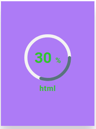
With required props.
- Required props to work.
{/*With required props.*/}
<cp-card cp-percentaje="30" cp-skill="html" />
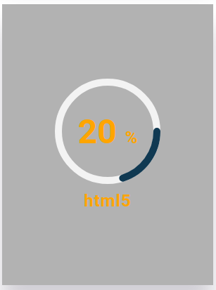
With optional props.
- Optional props to work.
{/*With optional props.*/}

  <cp-card
    cp-percentaje="20"
    cp-skill="html5"
    cp-text-color="orange"
    cp-background="rgba(0,0,0,.3)"
  />
DEMO
See a Code Sandbox React demo here.
Docs
Brief description of the component's props.
| prop | description | required |
|---|---|---|
| cp-percentaje | The percentaje value to be drawn by the progress bar. | REQUIRED |
| cp-skill | Percentaje description to show behind value. | REQUIRED |
| cp-text-color | Color of text, value and bar color in the component. | OPTIONAL |
| cp-background | Color of the card background. | OPTIONAL |


